
 +
+
GIA Platform
Growth Insights & Activation · Deloitte enterprise platform
I got a stalled enterprise design team moving again.
- Role
- UX Lead — onshore + offshore design teams
- Scope
- Design system · UX framework · cross-shore enablement
TIMELINE
- Jan 2024Joined as UX Lead
- 2024Rebuilt the design cycle
- 2024–25Inherited visuals · offshore reshape
- On-goingOperating at scale
One platform, five modules — each a different decision domain.
GIA is Deloitte’s internal enterprise platform for Account Leaders, Alliance Leaders, and sales teams. Five modules sit inside one shell, each cut for a different audience and a different decision.
Dashboard — An always-on monitor.
Surfaces each user's most-viewed views — a single pane of glass on what they already care about.
Account targeting — Find who fits.
Filter the client universe by a leader's own criteria — industry, revenue band, geography, deal stage — and get back a short-list ready for outreach.
Demand sensing — Read the market.
Surfaces market signals in each industry and sector so leaders can catch where opportunity is moving and reposition Deloitte's offer early.
Account deep dive — 360° on one account.
A full view of one account — tech stack, contract history, financial / operational performance, and forward-looking opportunities.
Growth platform (Alliance) — Partner-led pipeline.
How Deloitte and its alliance partners have sold together, and where the next "sell with" plays sit.
Challenges.
Three operational problems and three rebuilds. Each follows the same beat — what was broken, the move that fixed it, and what held after I stepped back.
CHALLENGE 01
Rituals over outcomes
The team was busy. Design pass after design pass came through — review, redraw, re-litigate. Yet the platform wasn’t moving. Every sprint repeated the same conversation because no one had agreed on why any of it was being built.
I cleared the rituals. Three steps survived — and they actually moved the team.
I just needed three things to make it move.
Each step feeds the next, and the chain is visible. Once PMs, engineering, and business stakeholders could see how an Outcome became a flow and a flow became a Blueprint, the “why are you doing this?” question stopped landing in design reviews.
01 · Identify the Outcome — the Genie question
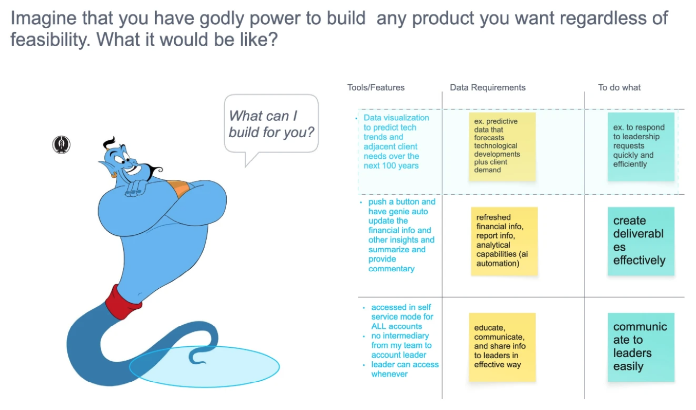
Removing the build constraint surfaces the north star and the real blocker in the same sentence.
02 · User story map — turn the outcome into a flow
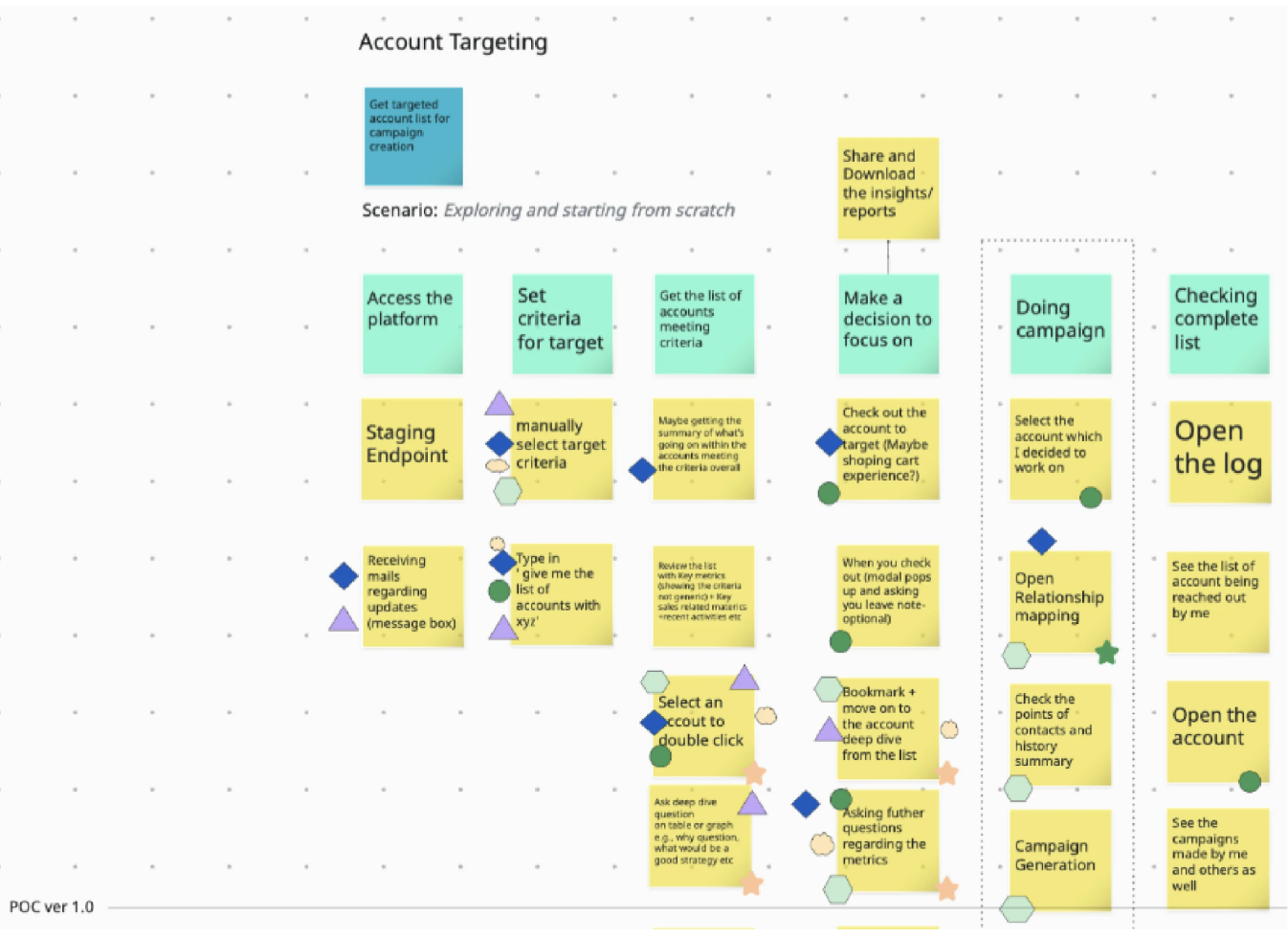
The outcome turned into a flow — who does what, in what order, against which data.
03 · Low-fi wireframe — turn the flow into a blueprint
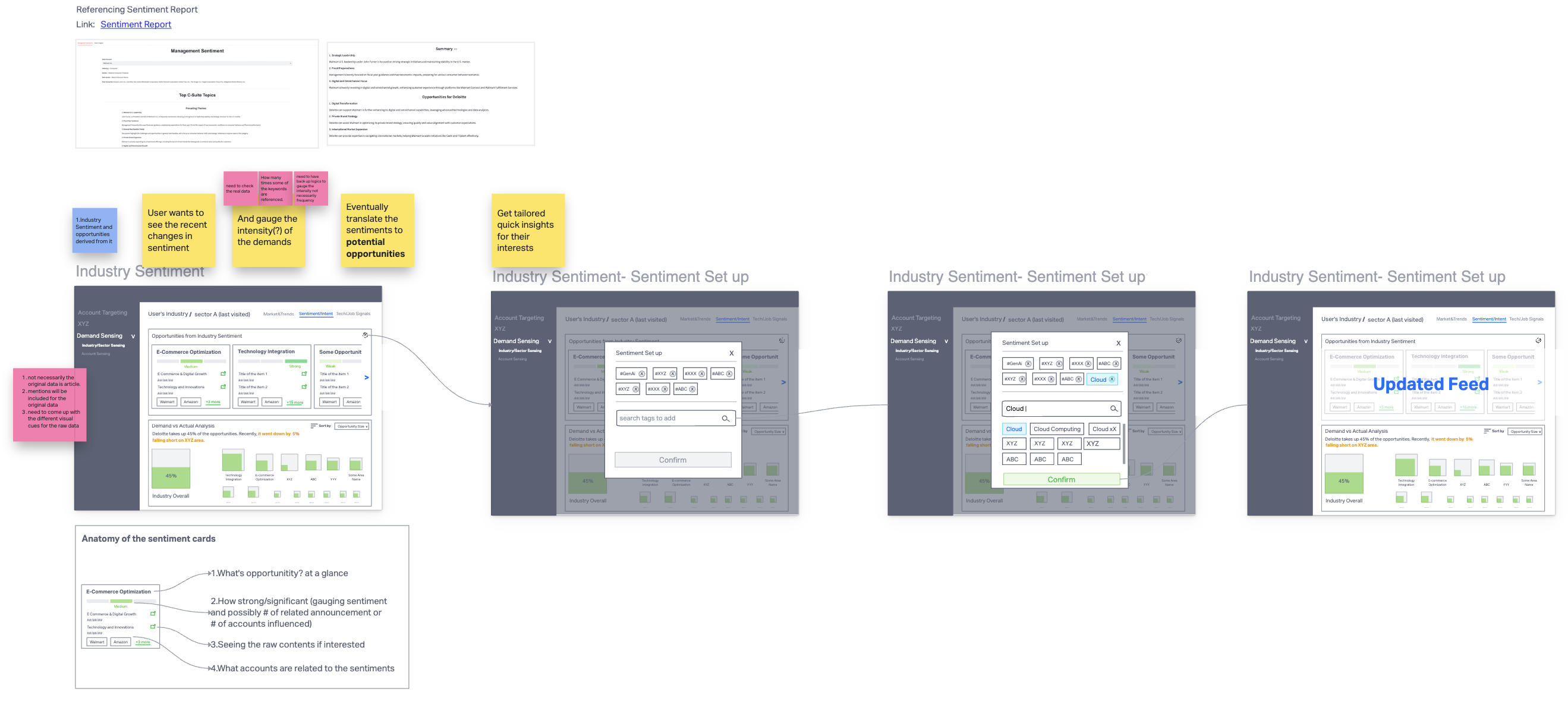
The flow turned into a blueprint — layout, state, and data contracts engineering builds to.
CHALLENGE 02
Familiarity over effectiveness
WHAT KEPT THE VISUAL
Personal attachment
Muscle memory · “we’ve always used it”
WHAT SHOULD KEEP IT
Effectiveness
Does the visual answer the question?
SOLUTIONAsk and validate what the visualization needs to answer.
2A · Forecasted Demand — the conflict
❓ QUESTIONS TO ANSWER
- Who has the biggest current value?
- Who will have the biggest future value?
- How much growth — or shrink — in between?
EXISTING VISUAL
⚠️ PROBLEMS
- X-axis = growth rate, Y-axis = future value, bubble size = current value — with no scale legend. Current values cannot be compared.
- No way to tell at a glance whether a value grew dramatically or shrank from a larger base.
- Drawn manually in PowerPoint — when bubbles overlapped, the deck builder repositioned them by hand. The visual stopped matching the data.
- Closer to a painting than a chart. Cannot scale.
✅ SOLVED BY
Setting the goal first and verifying the new visual answers it — which is what overcame emotional attachment to the existing version.
2B · Financial / Operational Metrics — the conflict
❓ QUESTIONS TO ANSWER
- Where does my account sit relative to its peers?
- Strong or weak — and on which metrics?
- Outlier, majority, or tail of the distribution?
EXISTING VISUAL
⚠️ PROBLEMS
- Distribution invisible.
- Outlier status invisible.
- Directional "strong / weak" read absent.
- Existing users coped on muscle memory; the next cohort wouldn't.
✅ SOLVED BY
Working backwards from the questions, listing the data needed, and picking a visual primitive — quartile box-plot cards — that made the answers readable at a glance.
CHALLENGE 03
Onshore / offshore productivity, not headcount.
Used as acting hands, offshore burned every overlap window on context transfer — not work.
Onshore / offshore isn’t a special model — everyone runs it. The failure mode is handing offshore acting work without the why; context breaks at the handoff, and the team works long but moves slow.
I split the designers into four profiles and approached each differently — the goal at every desk was autonomy and ownership, not handouts.
Foundational Builder
- Visual design
- Product thinking
- Stakeholder
Collaborative Leader
- Visual design
- Product thinking
- Stakeholder
Visual Specialist
- Visual design
- Product thinking
- Stakeholder
Strategic Convert
- Visual design
- Product thinking
- Stakeholder
- Solution
- Hand them a low-fi wireframe as scaffolding, then mentor them to extend it.
- Why it works
- Capable end-to-end, but stalls on articulating process upstream — the scaffold lets them own the flow without losing the thread.
- Solution
- Delegate a full product stream and put them in front of stakeholders.
- Why it works
- Visual and product muscles are already strong — the only gap is reps owning the room. Ownership accelerates the last leg.
- Solution
- Standalone visual tasks, paired with a Type 01 designer for the UX logic.
- Why it works
- Forcing UX reasoning solo would underuse the visual strength; pairing lets the visual ship while the product muscle grows on the side.
- Solution
- Hands-on training during onshore overlap — tools, fundamentals, applied UX.
- Why it works
- Business + stakeholder skills are the rare half; teaching the craft turns them into full-stack product designers faster than hiring would.
Re-evaluating talent instead of re-evaluating cost. Offshore became a velocity-and-talent lever, not a headcount one.
What shipped, what didn't, what I'd carry forward.
What went well
Reduction through the offshore enablement model.
Increased fidelity accelerated early releases.
Saved resources re-invested into parallel product launches.
What didn’t
A firm-wide design system was still out of reach — blocked by structural billing constraints, not by design or engineering will. The next leadership engagement will inherit that work.
What I learned
- Strong design systems are as much about education as execution.
- Systems solve what people can’t argue through.
Focusing on individual performance matters — but system-level changes solve the deeper, recurring problems more effectively. Frontend implementation inconsistencies got addressed by a design QA layer, not more meetings. Offshore collaboration improved by segmenting roles and reshaping the handoff.
When the system is clear, people can focus on the work — not on defending themselves.